Choosing paint colours for a Toronto condo is not the same as choosing colours for a house. The constraints are real: limited square footage, fixed window positions, north or south-facing light, shared building rules, and the constant pressure of the resale market.
In 2026, Toronto’s condo design landscape is shifting. The all-white era is over. Buyers and owners are moving toward warmer neutrals, grounded earth tones, and intentional accent colours that make small spaces feel layered, livable, and distinctly modern. Getting this right takes more than picking a paint chip. It takes understanding how Toronto’s light behaves, how your layout responds to colour, and what actually holds its value on the resale market.
What this guide covers:
- The 2026 Toronto Palette Shift: Which specific colours and families are dominating Toronto condo interiors this year and why.
- Lighting and Direction: How north, south, east, and west-facing condos require entirely different colour strategies.
- Neutral vs. Bold: A practical framework for deciding where to play it safe and where a statement colour adds real value.
- Resale-Friendly Choices: The colours that professional stagers and top Toronto real estate agents reach for every time.
What Are the Most Popular Condo Paint Colours in Toronto for 2026?
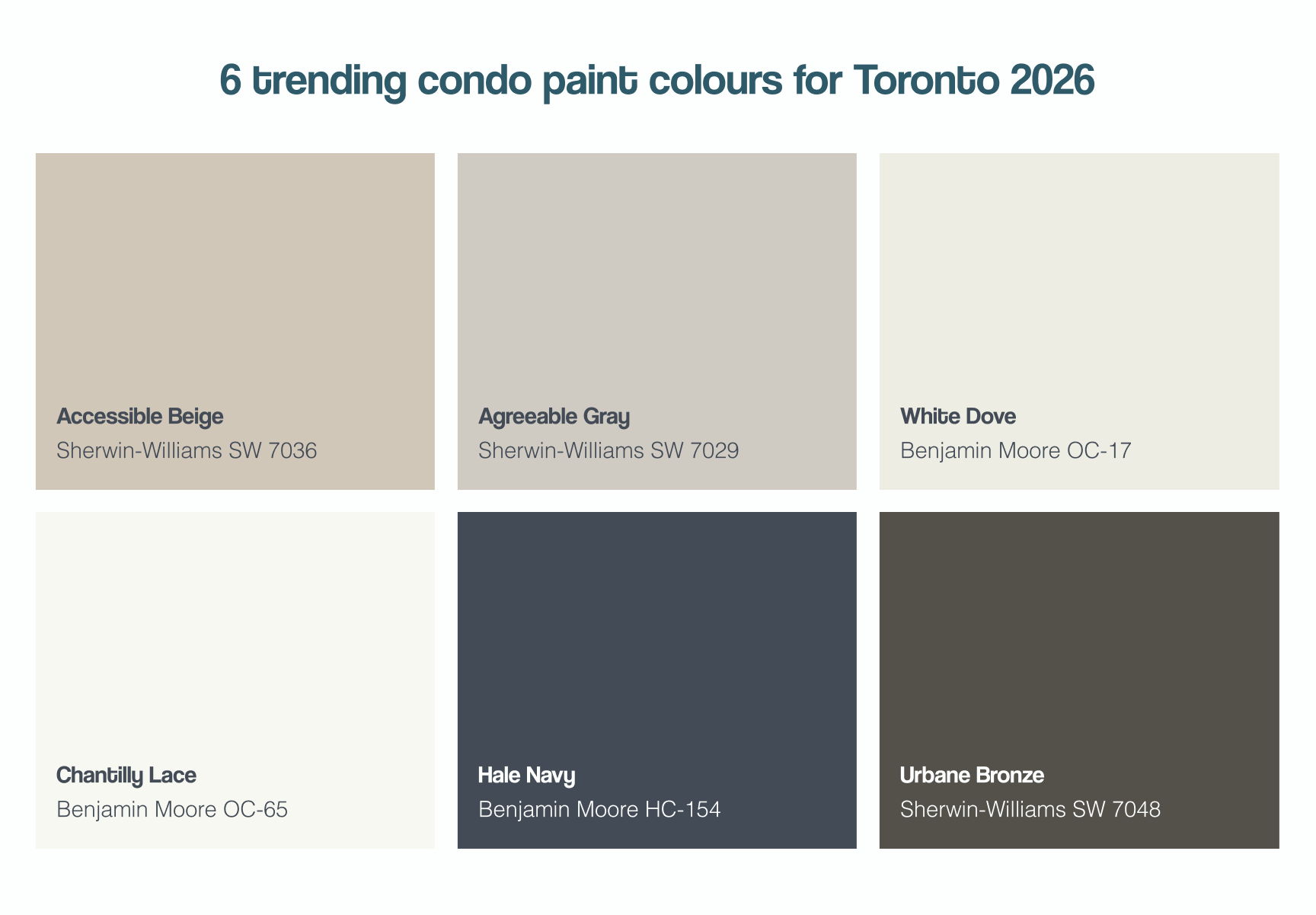
The following colours represent the most requested and professionally recommended choices across Toronto condo projects in 2026:
| Colour Name | Brand + Code | Best Room Use | Why It Works in Toronto Condos |
| Accessible Beige | Sherwin-Williams SW 7036 | Living/Dining, Bedroom | Warm undertone reads beautifully in south and west-facing units. Never cold. |
| Agreeable Gray | Sherwin-Williams SW 7029 | Whole-unit neutral | Toronto’s most popular resale neutral. Works in any light direction. |
| White Dove | Benjamin Moore OC-17 | Ceilings, trim, open layouts | Warmer than pure white. Prevents the cold, clinical look in north-facing units. |
| Chantilly Lace | Benjamin Moore OC-65 | Bright, south-facing rooms | Crisp true white that only works when natural light is abundant. |
| Hale Navy | Benjamin Moore HC-154 | Accent wall, den, bedroom | Deep, rich tone that adds drama in small spaces without overwhelming them. |
| Urbane Bronze | Sherwin-Williams SW 7048 | Feature wall, living room | Benjamin Moore Colour of the Year adjacent. Grounded, sophisticated. |
| Dusty Miller | Sherwin-Williams SW 9166 | Bedroom, bathroom | Muted sage green. One of the defining condo colours of 2025-2026. |
| Colonnade Gray | Sherwin-Williams SW 7641 | Open-concept living areas | Medium-value gray with warm undertones. Bridges warm and cool palettes. |
| Simply White | Benjamin Moore OC-117 | Kitchen, bathroom | HGTV and designer favourite. Slightly warm, works year-round. |
| Thunder | Benjamin Moore 2117-30 | Accent wall, office nook | Deep charcoal. Adds depth and creates a focal point in compact layouts. |
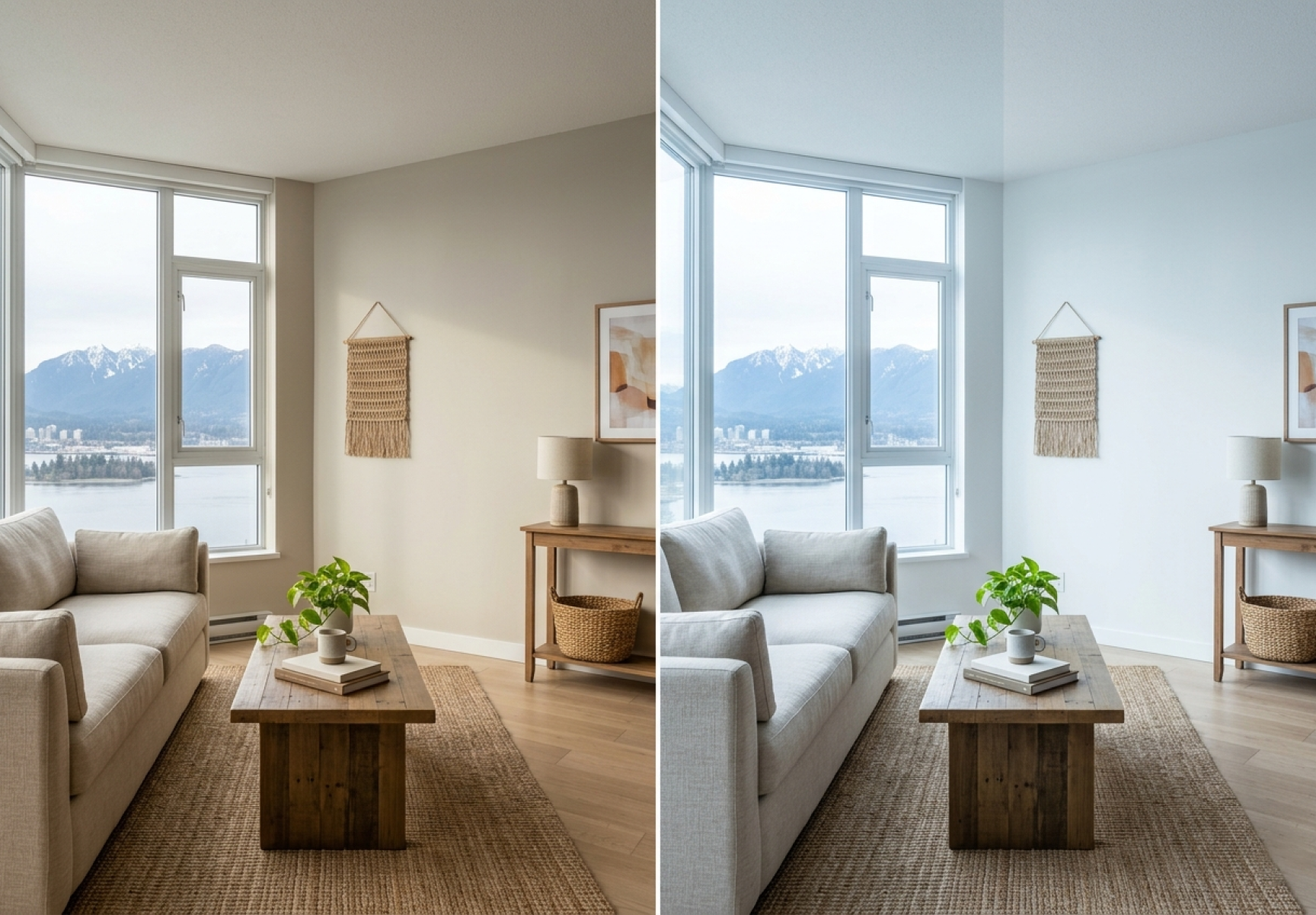
How Does Your Toronto Condo’s Light Direction Change Which Colours Work?
North-Facing Condos: Avoiding the Cold, Blue Look
North-facing Toronto condos receive cool, indirect light all day. Blues and pure whites amplify this coolness, making the space feel cold and smaller than it is. The fix is warmth.
Best colour strategies for north-facing units:
- Warm whites: Benjamin Moore White Dove (OC-17) or Sherwin-Williams Alabaster (SW 7008) rather than Chantilly Lace.
- Warm neutrals: Accessible Beige, Agreeable Gray, or Colonnade Gray all have warm undertones that counterbalance cool light.
- Avoid: Pure whites, blue-grays, and anything with a purple or lavender undertone. These read cold and flat in north light.
South-Facing Condos: Managing the Brightness
South-facing Toronto condos receive the most direct sunlight. This means colours shift throughout the day and brighter whites and cooler tones actually perform well. The challenge is preventing the space from feeling washed out at peak afternoon light.
Best colour strategies for south-facing units:
- Crisp whites: Chantilly Lace (OC-65) and Simply White (OC-117) come alive with direct natural light.
- Light cool grays: Repose Gray (SW 7015) and Classic Gray (OC-23) prevent the wash-out effect while staying light.
- Statement colours: Deep accent colours like Hale Navy and Thunder read at their most accurate and richest in south-facing light.
East and West-Facing Condos: Playing the Shifts
East-facing units are bright in the morning and dim by afternoon. West-facing units are the opposite. Both benefit from mid-range warm neutrals that look good across the light shift rather than being optimized for one time of day.
- East-facing: Agreeable Gray, Accessible Beige, and Colonnade Gray all transition well from bright morning to dimmer afternoon light.
- West-facing: Warm whites like White Dove and warm greiges like Edgecomb Gray (HC-173) catch the golden afternoon light beautifully.
How Ceiling Height Changes Colour Selection in Toronto Condos
Many Toronto condos, particularly those built before 2010, have 8-foot ceilings. Ceiling height is one of the most important variables in colour selection.
| Ceiling Height | Wall Colour Strategy | Ceiling Colour Strategy |
| 8 feet | Use lighter values to avoid closing in the space. Keep wall and ceiling colour close in value. | White Dove or Chantilly Lace to add perceived height. |
| 9 feet | More flexibility. Mid-tone neutrals work well without making the space feel small. | Ceiling can match walls for a cohesive wraparound effect. |
| 10+ feet | Can support deeper, richer tones. Statement colours become viable on all walls. | Ceiling colour matching walls creates drama; use intentionally. |
Which Colour Palettes Are Defining Toronto Condo Interiors in 2026?
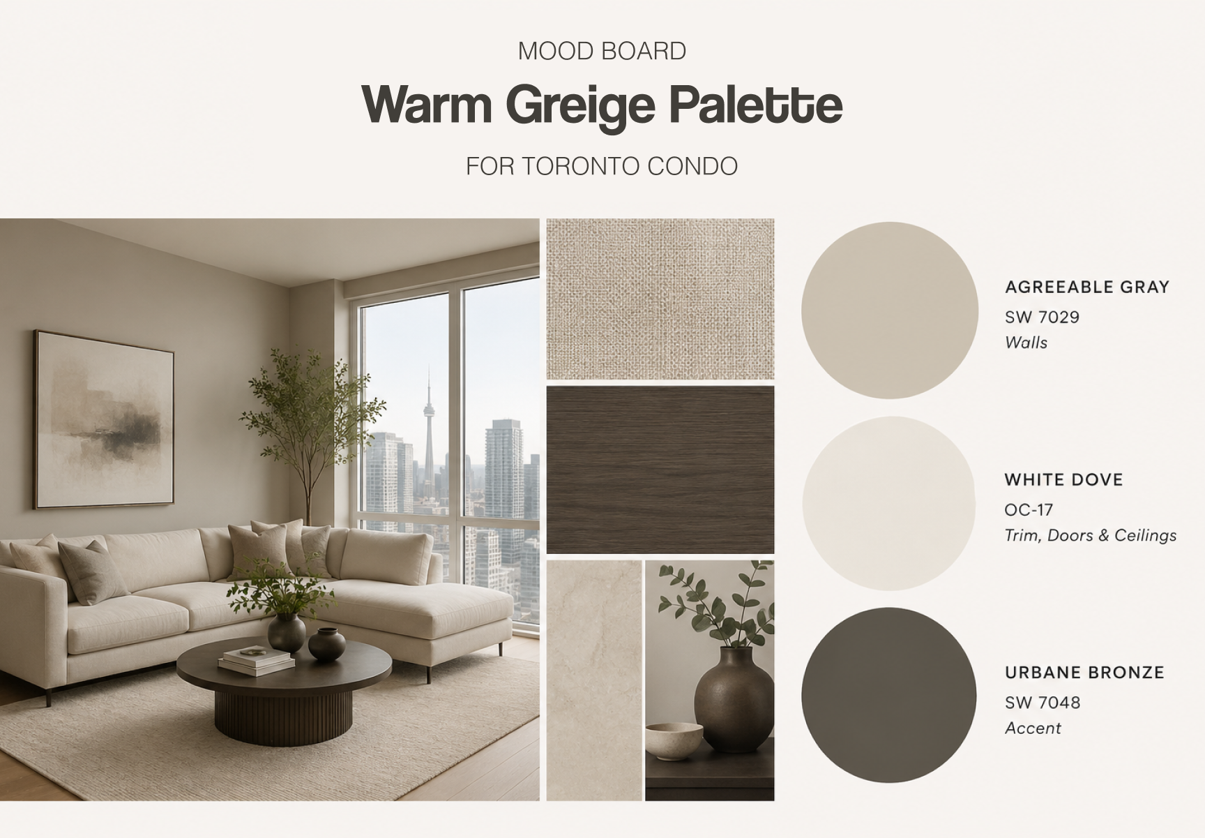
The Warm Neutral Palette: Greige Dominance
The dominant palette across Toronto condo renovations and listings in 2026 is warm greige, the blend of grey and beige that replaced cool gray as the default neutral. This palette reads as sophisticated and livable without the clinical coldness of the all-white-and-gray era.
A complete warm neutral palette for a Toronto condo:
- Walls: Agreeable Gray (SW 7029) or Accessible Beige (SW 7036)
- Trim and baseboards: White Dove (OC-17) or Chantilly Lace (OC-65)
- Ceiling: White Dove (OC-17)
- Accent wall or bedroom: Urbane Bronze (SW 7048) or a deep warm tone one to two shades deeper than the main wall colour
The Earthy Organic Palette: Sage, Stone, and Terracotta
Driven by a broader design movement toward natural materials and biophilic design, muted greens, stone tones, and warm terracottas are appearing in Toronto condos at a rate not seen in previous years. These colours work best as accent choices in open-concept layouts rather than whole-unit applications.
A complete earthy organic palette for a Toronto condo:
- Walls: Accessible Beige (SW 7036) or a warm off-white as the base
- Accent feature wall or bedroom: Dusty Miller (SW 9166) or Boreal (Benjamin Moore 462)
- Bathroom or powder room: Pale Oak (OC-20) or Soft Chamois (OC-13)
- Kitchen cabinet accent: Dried Thyme (SW 6186) if paired with warm wood tones
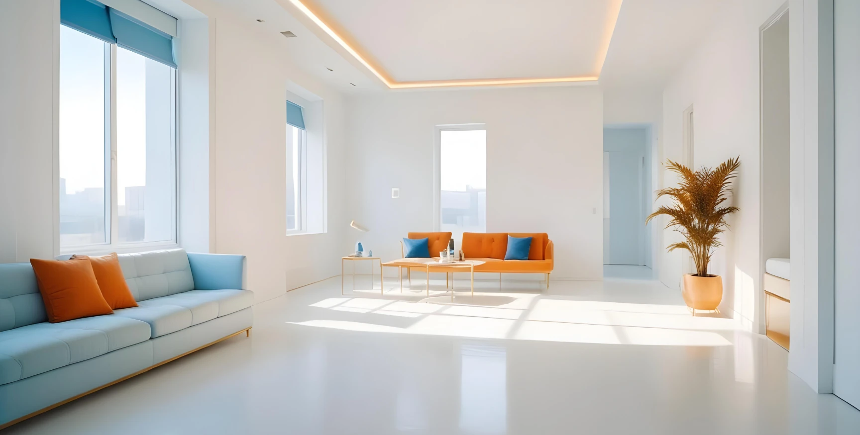
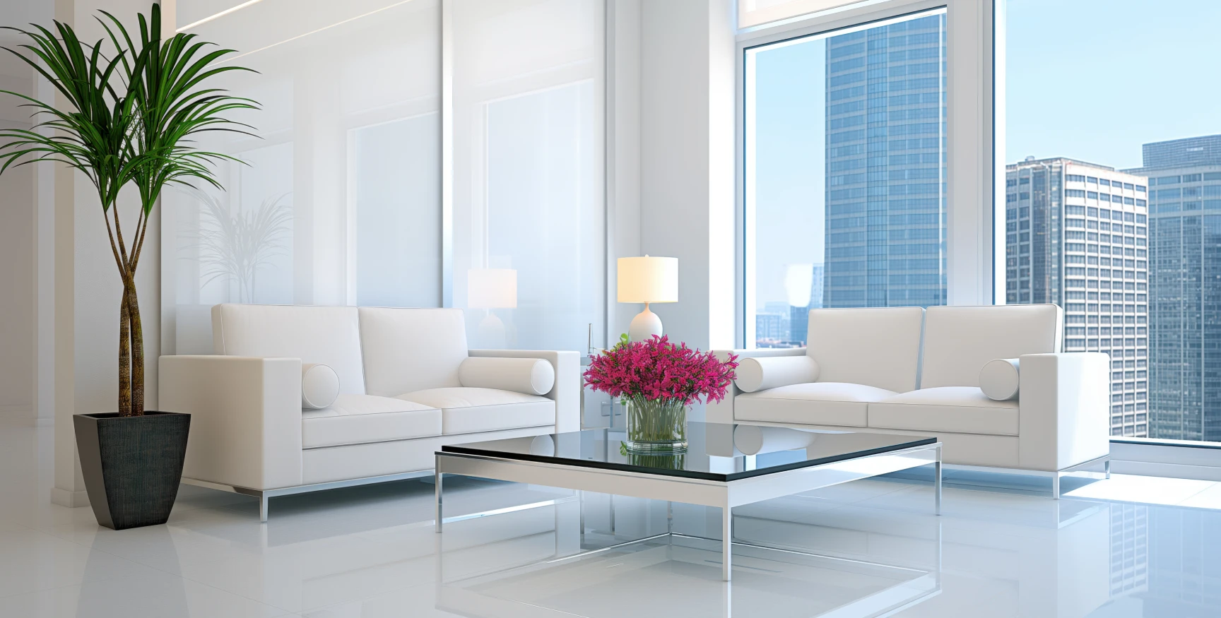
The Modern Monochromatic Palette: Whites Done Right
All-white condos remain popular with investors and short-term rental owners because of their broad appeal. But the quality of white matters enormously. Using one white throughout often creates a flat, institutional look. Layering warm whites with slightly deeper trim creates dimension without introducing new colour.
A layered white palette for Toronto condos:
- Walls: Simply White (OC-117) or Chantilly Lace (OC-65)
- Trim: White Dove (OC-17) – one shade warmer than the walls
- Ceiling: White Dove (OC-17) or ceiling white tinted 25% warmer
- Accent: A single soft warm tone in the bedroom – Stone Hearth (OC-16) or Pale Oak (OC-20)
Should You Use Neutral or Bold Colours in a Toronto Condo?
When Neutral Colours Are the Right Call
Neutral colours are the right choice in the following situations:
- You are preparing the unit for sale or rental
- The condo has limited natural light or faces north
- The layout is open-concept and the colours need to flow seamlessly
- The unit is small (under 600 sq ft) and you need the space to feel larger
- You want to maximize broad buyer or tenant appeal
For all of these scenarios, a professional interior painting service ensures the neutrals are applied with the clean edges and even finish that actually makes them work.
When a Bold or Statement Colour Adds Real Value
Bold colours make sense in specific applications:
- Single accent wall: A deep tone on one wall in a living room or bedroom adds depth and personality without dominating the space.
- Bathroom or powder room: Small rooms with no windows are the perfect place to use a rich, dramatic colour. The enclosed space amplifies the effect.
- Den or home office nook: A deeper colour in a dedicated work area creates visual separation in open-plan layouts.
- Ceiling as fifth wall: A soft colour on the ceiling in a bedroom (dusty blue, warm sage) adds a design element that photographs exceptionally well.
The Resale Rule: What Colours Protect Your Investment
Toronto real estate agents and professional home stagers consistently recommend the same colour families when preparing condos for sale. The goal is broad appeal with warmth, not sterility.
| Resale Scenario | Best Colour Choice | Colours to Avoid |
| Whole-unit repaint before listing | Agreeable Gray or Accessible Beige | Builder beige (yellow-tinged), stark white, any bold colour on multiple walls |
| Touch-up for rental turnover | Match existing Agreeable Gray or repaint in Simply White | Anything trendy that may date quickly |
| Luxury or prestige listing | White Dove walls with White Dove trim and subtle accent | Flat white (looks cheap in photos), dark colours throughout |
| Investor flip or quick sale | Chantilly Lace or Agreeable Gray – two coats, clean lines | Multiple accent colours, feature walls in multiple rooms |
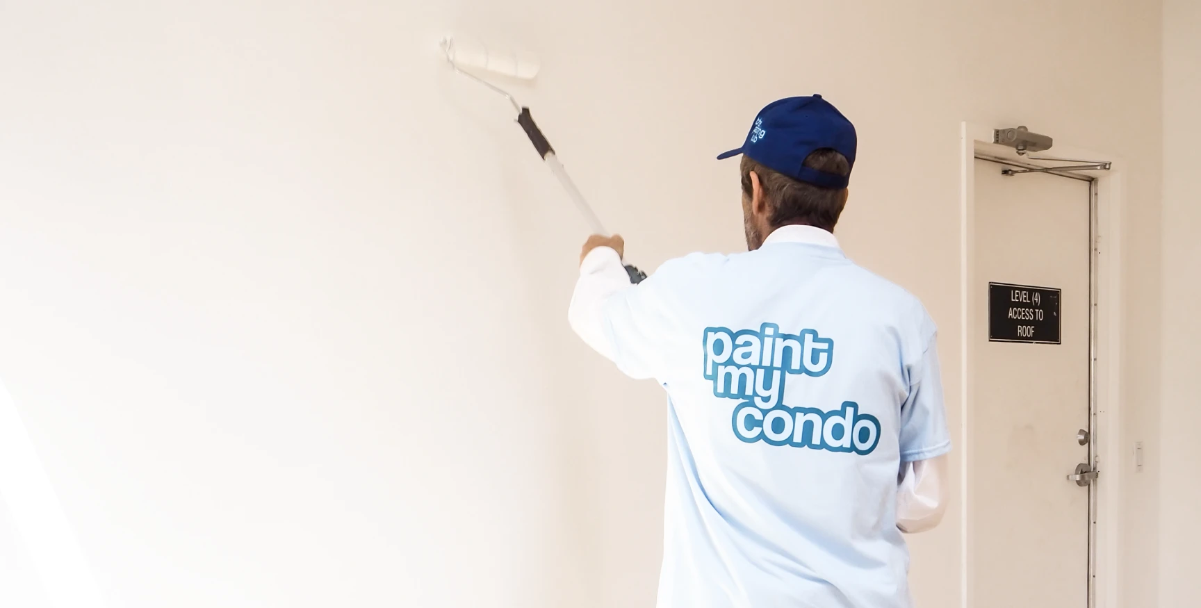
Paint My Condo offers expert colour consultations for Toronto condo owners preparing to sell. Our colour specialist visits your unit, evaluates your lighting and layout, and recommends the specific palette most likely to shorten your time on the market. Get a free online quote at paintmycondo.com.
What Does It Cost to Paint a Toronto Condo in 2026?
Toronto condo painting costs vary based on several clear factors:
| Factor | Typical Range | Notes |
| Studio or 1-bedroom unit (colour match) | $500 – $900 | Single coat, same colour, walls only |
| Studio or 1-bedroom (colour change) | $900 – $1,400 | Two coats, walls + ceiling |
| 2-bedroom unit (colour change) | $1,400 – $2,200 | Full repaint with trim |
| Cabinet refinishing (kitchen) | $1,200 – $2,500 | Depends on door count and finish |
| Colour consultation add-on | $142 approx. | Designer visits your unit – highly recommended |
| Popcorn ceiling treatment | Additional charge | See popcorn ceiling guide below |
Paint My Condo provides instant transparent pricing online. What you see in the quote is what you pay, with all materials and prep included. Calculate your exact price at paintmycondo.com.
What Makes a Tier One Toronto Condo Painting Company?
When choosing who applies your carefully selected palette, these qualities separate professional results from disappointing ones:
- Condo-specific expertise: Navigating building rules, concierge coordination, service elevators, and HOA requirements is not standard residential painting knowledge.
- Premium paint brands only: Paint My Condo uses top grades from Sherwin-Williams, Benjamin Moore, and Dulux. The quality of the paint determines how long your colour looks fresh.
- Proper prep as standard: Nail holes filled, surfaces sanded, electrical plates removed. Colour only looks right on a properly prepared surface.
- 3-year warranty: An industry-leading warranty on every project.
- $5M liability insurance and WSIB compliance: Full protection for your unit and building.
- Background-checked crews: You are inviting these professionals into your home. Trust matters.
Frequently Asked Questions


 5 star reviews